
Printing Proofs: Pay Extra Attention to Contact Information

estimated reading time: 3 minutes
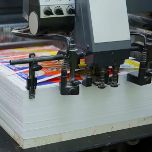
Printing Proofs
In the fields of printing and graphic design, Proofs are an
important step in the print production process. Proofs are created to provide a
visual representation of how a project will appear once it is printed.
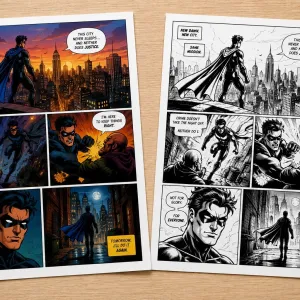
Proofs are most commonly provided in a digital format, such
as a PDF. However, proofs are sometimes created as a printed hard copy or
physical mock-up.
Proofs are provided to clients before any actual printing
takes place. This gives the client a chance to carefully review the proof and
give their approval before the project enters into press production. This feedback
from clients is important because it helps to ensure a successful outcome.

Why does Contact Information need extra scrutiny?
Proofs provides clients with a final chance to catch any errors
within the printed content. A careful review of the proof goes a long way toward
minimizing the need for a reprint, which would add unnecessary cost, time, and
aggravation to a project.
That said, you may be surprised to learn that of all the content a printed piece might contain, the Contact Information is the area most overlooked by clients during the proofing phase.
What makes this so surprising
is that having the correct contact information is crucial to a business or organization, especially for printed
pieces used for marketing and promotional purposes.
A theory as to why incorrect Contact details aren't always caught during Proofing
Whether the project is a simple business card or a multi-page
brochure, the contact information will almost always contain proper names, such
as the names of people, companies, streets, cities, and websites, as well as
numeric data like addresses, phone numbers and extensions.
Because every company has unique contact information, the graphic
artist who initially added this data to the artwork layout is likely unfamiliar
with it. Hence, a spelling or transposition error will not necessarily stand
out to them. So "unfamiliarity" is often to blame for how a mistake originally gets
into the artwork.
Now, when the client gets the proof of the artwork to review, the situation
will often flip so that "familiarity" now becomes the issue. When proofreading,
people tend to gloss over data they see on a regular basis. As such, the most familiar data rarely gets
the required scrutiny.
For example, a person can see their business phone number of "800-555-5668" so many times over the years that they miss the fact that it is showing
as "800-555-5688" on a brochure proof. Or a sales manager could easily overlook that his salesperson's business card shows the
name Jonathon instead of Jonathan. The human brain often sees what it expects to
see rather than what is really there.
More Eyes are Better than just Two
In addition to our recommendation to give extra scrutiny to Contact
Information, it is also advisable to have several people review a proof. Things
can be easily overlooked when relying on just one set of eyes.
Color Vision is always ready to help!
Color Vision has been offering quality printing since 1984. We always provide proofs to ensure the best outcome for your project.
Also, we have great pricing on book printing, full color printing, laminated
printing and more.
Just give us a call at 800-543-6299 to discuss your project.
Or, use our Quote Request form to send us your specifications and we will email
you a quote.
As always, we look forward to assisting with your custom
printing needs!
Related Article: Soft Proofs vs Hard Proofs
Related Articles

What Is the Best Binding Method for Training Manuals?
Read This Article
10 Signs It’s Time to Use a Trade Printer
Read This Article
Printing Paper: Text Weight vs Cover Weight Explained
Read This Article
Why Color Printing Costs More than Printing in Black Ink
Read This Article