
9 Tips for Printing User-Friendly Workbooks and Study Guides
estimated reading time: 10 minutes
Whether you are creating educational materials for a school,
business, church, healthcare center, or another organization,
well-designed workbooks and study guides can make learning easier and improve
information retention.
While the content is the most important part of
instructional materials, their physical construction and formatting also play
significant roles in how easy the materials are to use.
From selecting the right binding method to choosing paper
that is comfortable to write on, thoughtful decisions upfront can help create
workbooks and study guides that people will be more likely to use effectively.
Below are 9 practical tips to ensure your printed materials are user-friendly...
1. Choose the Right Binding Style
One of the most important decisions is selecting a binding
style that fits the way the book will be used.
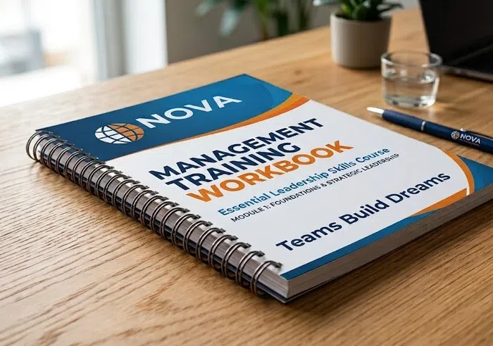
Spiral Binding uses a durable PVC coil as its spine. The
helical coil allows a book to lie completely flat without having to be held
open. A spiral bound book can also fold back on itself, thus saving room on a
desk or work surface. These features make spiral bound books an ideal choice for
classrooms, workshops, and field training.
Wire-O Binding offers the same lay-flat functionality as
spiral binding. However, wire-o binding uses a spine element that is constructed of twin loops of metal wire instead of PVC plastic. As such, it offers a
more sophisticated appearance. Wire-o binding is available in a variety of colors as well as several metallic finishes.
Perfect Binding uses a strong but flexible adhesive to
secure the pages within a wraparound cover. This method produces a flat,
printable spine and is a good choice for thicker books. However, perfect bound
books do not lie completely flat when opened, which can make them less suitable for
workbooks and study guides that require frequent writing or note-taking. The spiral and wire-o binding methods are better suited for workbooks and study guides that need to lie flat for hands-free referencing and/or be written in.
Selecting the appropriate binding will improve the book's
usability from the first page to the last.

2. Use Paper That Is Easy to Write On
To support learning, workbooks and study guides often
include interactive exercises, questions, fill-in-the-blank sections, and other
activities that require a written response. Because readers will be writing
directly on the pages, choosing a paper that provides a comfortable, reliable
writing surface is important.
Uncoated paper
is generally a better choice than gloss or other coated papers for pages designed to be written on. Uncoated paper
has a more natural, porous surface that allows pencil lead and ink to adhere
readily without the smearing that can occur on coated paper. This makes it
easier for readers to write, erase, and highlight as they work through the
material.
Traditional offset and other uncoated text papers are
commonly used for workbooks and study guides because they provide an excellent
writing surface while remaining relatively economical. A popular choice is 70#
white offset, which provides a good balance of writing comfort and
affordability. It also offers enough opacity and thickness to minimize
show-through.
3. Leave Plenty of Space for Notes
One of the most common design mistakes when creating a
workbook or study guide is trying to fit too much information onto each page.
While it may be tempting to reduce margins and minimize blank space in order to
keep the page count down, doing so can reduce the functionality of a workbook
or study guide.
Generous margins, open writing areas, and even a few blank
pages give readers room to make notes without feeling cramped. So, when
designing a workbook or study guide, don't think of blank areas as wasted
space. On the contrary, they can contribute positively to the learning
experience by providing places for users to record handwritten notes and
annotations.
Another benefit of being generous with white space is that
it makes each page easier to read by giving the eyes a visual break between
sections of text, images, questions, and activities. A well-spaced page may
contain slightly less information, but it can make the content much easier to
understand and use.

4. Select a Comfortable Font Size
Avoid using tiny fonts as they will have a negative effect on readability. For most printed
workbooks and study guides, using a font between 10 and 12 points for the body
copy will provide a comfortable reading experience. However, the appearance of
a particular font can vary considerably at the same point size, so the typeface
you choose is also important.
Headings and subheadings should be large enough to stand out
clearly from the body copy and help readers quickly identify different
sections. Using larger type and bold lettering can create a clear visual
hierarchy and make it easier for readers to scan the page and find the
information they need.
Also, when selecting fonts for instructional content, avoid
overly decorative or elaborate typefaces. While the style may look appealing, these can be more difficult to read, particularly when used for longer passages of
text. Simple, easy-to-read typography can help reduce eye fatigue, especially
when workbooks and study guides are used for long sessions of reading and studying.
Finally, try to use fonts consistently throughout the
publication. Limiting the number of typefaces and establishing consistent sizes
for body copy, headings, subheadings, captions, and other elements creates a
cleaner appearance and makes the material easier to navigate.
5. Include Durable Covers for Books That Will See Frequent Use
Workbooks and study guides that will be subject to frequent
use can benefit from a thicker, more durable cover. A heavier cover stock
provides additional protection for the interior pages while helping to resist
bending, creasing, and other rough treatment.
As a general guideline, 10pt cover is a good choice for
light-duty workbooks, while 12pt cover provides additional strength for
materials that will receive moderate use. For workbooks that will be handled
frequently or need to withstand extended use, 14pt cover is an excellent
choice. The thicker stock provides a more substantial feel and greater
resistance to the wear that comes with repeated handling.
Adding a protective coating or laminate to the cover can
provide another level of protection. UV coating creates a hard, protective
finish that can resist scuffing and everyday handling. UV Coatings can also
enhance the appearance of printed ink colors. For example, a gloss UV coating
adds depth and vibrancy to the underlying ink colors, whereas a matte UV
coating softens the ink colors.
Laminates provide an even greater level of protection. A
laminate is a thin plastic film bonded over the printed cover. Gloss and matte
laminates can protect against tears, scratches, moisture, and general wear.
Gloss laminate provides a smooth, reflective finish that can make colors appear
more intense, while matte laminate reduces glare and provides a more subdued
appearance.
If durability is a high priority, a 14pt cover combined with
a protective laminate is a particularly good choice for study guides,
workbooks, training manuals and any other printed materials that will be used
repeatedly. A 10pt or 12pt cover may be perfectly suitable for lighter
applications, but choosing 14pt cover with a protective finish provides an
added level of protection for materials expected to have a longer useful life.
6. Organize Content into Short Sections
Readers learn more effectively when information is presented
in manageable sections. Large blocks of uninterrupted text can make a workbook
or study guide feel dense and difficult to navigate, especially when readers are
expected to work through many pages of material. Breaking information into
shorter sections creates visual separation and makes the subject material feel
more approachable.
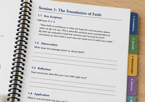
Use clear section headings to introduce new topics and help
readers understand what each section covers. Short paragraphs can make
explanations easier to read, while bulleted and numbered lists can simplify
information that is presented as a series of items or steps. Callout boxes can
also be useful for highlighting important points, definitions, reminders,
examples, or other information that readers may need to find quickly.
When designing a printed workbook or study guide, consider
how the pages will look when viewed as a whole. A page with a good balance of
text, headings, lists, and white space is generally easier to scan than one
filled from top to bottom with continuous text. Organizing the content into
smaller sections also gives readers natural stopping points, which can be
especially helpful when materials are designed to be used over multiple study
sessions.
Instead of long pages filled with uninterrupted text,
consider using:
- Short paragraphs
- Bulleted lists
- Numbered steps
- Callout boxes
- Descriptive section headings
This approach not only improves readability but also helps
readers quickly locate important information when they need to review a
specific topic or return to the material later.
7. Consider Adding Tabs or Color Bars for Lengthier Study Guides
Many workbooks and study guides contain numerous lessons,
chapters, or training modules. When a document becomes lengthy, finding a
specific section can become frustrating if the only option is to flip through
page after page. Adding visual or physical markers can make longer materials
much easier to navigate.
Printed tab extensions can provide a clear separation
between major sections and make it easy for users to return to a specific
topic. Tab extensions can be incorporated into divider pages and can
make a significant difference in how easily users can find the information they
need. Because tabbed dividers are often made of a thicker paper stock, they
work best with spiral coil binding or wire-o binding.
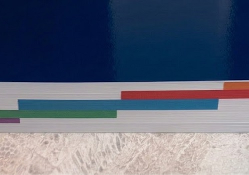
Color bars offer another way to organize a lengthy document
without adding physical tab extensions. Printing different colors along the
edge of each page in a section can be especially helpful when a workbook
contains several distinct subjects or when users are expected to return to
individual sections over time. Color bars work well with any binding style.
Because tabs and color-coded sections help break up a
lengthy workbook visually, they make the material feel more organized and
approachable. If your workbook or study guide contains numerous lessons,
chapters, or training modules, consider incorporating tabs or printed color
bars to make it easier for users to find and return to the information they
need without having to flip through dozens of pages.
8. Choose Practical Dimensions
The finished dimensions of your workbook or study guide
should match how it will be used. For example, 8.5" x 11" is a
practical choice because it provides plenty of room for instructional content,
exercises, charts, and written responses. The larger page size also gives users
more room to take notes without making the book unnecessarily thick. For study
guides that need to be carried from place to place, a smaller size such as
5.5" x 8.5" or 6" x 9" may be more convenient and portable.
Also, when cost is a consideration, it is often best to choose a standard size rather than an unusual or custom dimension. Standard sizes make more efficient use of the parent sheets of paper used during the printing process, which can help control paper waste and production costs.
Before designing your workbook, consider how much space your
content actually requires, how portable the finished piece needs to be, and how
users will interact with it. Choosing the right size from the beginning can
improve usability while helping you avoid unnecessary printing costs.
9. Number Every Page
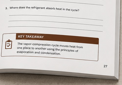
Page numbers may seem like a small detail, but they become
extremely valuable when a workbook or study guide is used for classroom
instruction, training sessions, or group study. Instructors can quickly direct
participants to a specific page without having to describe where the
information appears. A simple instruction such as "turn to page 27" is much
easier to follow than asking users to locate a particular lesson, question, or
section.
Page numbers are also helpful when users review material on
their own. Numbered pages make it easier to return to previous lessons, locate
a particular exercise, or refer back to information discussed earlier in the
workbook. Also, if participants are taking notes during a class or training
session, numbered pages provide a convenient way to identify where those notes
were made. This can be especially helpful when the workbook contains multiple
lessons or sections.
For longer workbooks and study guides, consistent page
numbering can make the entire publication easier to navigate. Numbers should be
placed in a predictable location, such as the bottom outside corners or
centered at the bottom of each page, and they should be easy to see without
competing with the main content. A little attention to this simple detail can
make your finished workbook or study guide more organized and user-friendly.
Bottom Line: Create Learning Materials That People Enjoy Using
Workbooks and study guides should do more than simply hold
information - they should make learning easier. Using the right paper, binding,
layout, and printing options can greatly improve the user experience and
enhance the overall quality of your printed materials.
If you're planning to print workbooks or study guides for
your organization, working with an experienced commercial printer will help you
select the most appropriate materials and printing options for your project.
Even a few small decisions made before going to press can make your bound
documents easier to read, easier to write in, and more effective for your
audience.
Color Vision has been helping customers print high-quality workbooks, study guides, and other educational materials for decades. So we'll be happy to provide you with a custom quote. Just fill out our simple Quote Request form or give us a call at 800-543-6299. We'd welcome the opportunity to assist with your next print project.

Pete is a member of the Color Vision team and has nearly 20 years experience in printing, design, and marketing. He writes about a wide range of print-related topics, including book printing and binding, full-color printing, paper types, and finishing techniques. His articles contain simple, straightforward explanations, helping people to better understand their printing options and make more informed decisions about their projects.
Related Articles
NCR Forms: How does Carbonless Paper Work?
Read This Article
Custom Booklet Printing: What are Common Booklet Sizes?
Read This Article

The Cost of Book Printing: Which Factors affect it the Most?
Read This Article

The Difference between a Brochure and a Pamphlet
Read This Article