
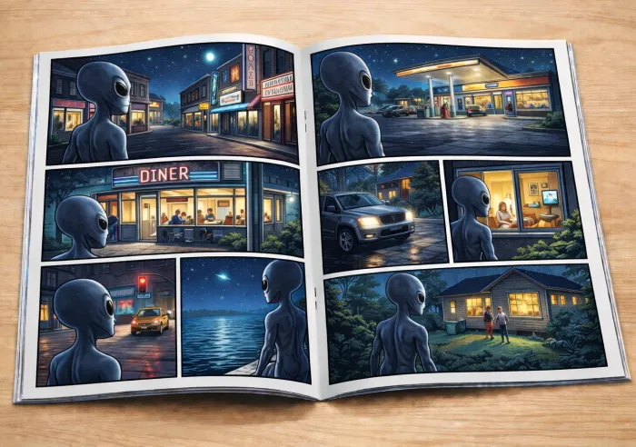
Common Comic Book Printing Mistakes (and How to Avoid Them)
estimated reading time: 7 minutes
From Pixels to Paper: Tips for a Smooth Comic Printing Experience
Printing a Comic Book is a rewarding milestone for creators, illustrators, and publishers, marking the moment when the creative vision finally becomes something tangible. However, it can also feel a bit overwhelming to those unfamiliar with the process. Uncertainty about file preparation, paper selection, or production methods often leads to concerns about making a costly mistake.
The good news is that comic book printing doesn't have to be
intimidating or stressful. By learning about the common missteps others have
made - and understanding how to avoid them - you can approach the printing
process with greater confidence, preserve your creative vision, and produce a
comic that looks as good in print as it does in your imagination.
Below are some of the more common comic book printing mistakes, along with practical tips on how to avoid them before your project ever goes to press. And don't hesitate to ask your printer for guidance or recommendations if you have any additional questions or concerns.
1. Submitting the Layout in RGB Instead of CMYK
RGB (Red, Green, Blue) is a light-based color model. Digital
screens, such as computer monitors and drawing tablets, use RGB. These screens start
with darkness and add light to create colors. Because light can be varied
continuously in brightness and intensity, RGB can produce an extremely large range
of colors.
CMYK (Cyan, Magenta, Yellow, Black) is an ink-based color
model. Commercial printing presses use the CMYK color model, which is the
industry standard. Printing starts with white paper and removes light by
absorbing it. Each ink color absorbs certain wavelengths of light and reflects
the rest. Because inks are physical materials with absorption limits, CMYK is
unable to reproduce as many colors as light-based RGB.
Also, because printed pages are not backlit like digital
screens, many CMYK colors will naturally appear less bright than their RGB
counterparts. That doesn't mean comic books can't be printed with a wide range
of bold, vibrant colors - it simply means some hues will look different in
print than they do on screen. These differences are a result of the physical
properties of light and ink, not a mistake in the printing process.
Now here's the main point: if you submit RGB artwork to a commercial
printer, the printer will have to convert it to CMYK in order to be printed. Because
CMYK printing cannot accurately reproduce all RGB colors, this conversion can
sometimes cause unexpected shifts in color and certain tones may lose the vibrancy
they exhibited in RGB. So always review and submit your artwork files in CMYK.
Planning for print color early gives you far more control
over the final appearance of your comic. For example, setting your layout
software to the CMYK color mode early in the creation process will allow you to
tweak colors intentionally so what you see on your screen will be closer to the
final printed result.
How to avoid unexpected color changes:
- Set your document to CMYK color mode from the beginning
- Use CMYK-safe color palettes when possible
- Realize that not all screen colors can be accurately reproduced in print
- Request a hard copy proof for color critical pages
- Review proofs carefully, especially for bright and saturated colors
- Planning for print color early gives you far more control over the final appearance of your comic.
2. Selecting the Wrong Paper Type
Paper choice dramatically affects how ink will appear on the
page. A paper that works well for text-heavy books like novels, manuals, or
reference books may not be ideal for artwork-heavy comics.
Common mistakes when selecting a paper stock include:
- Paper too absorbent - ink colors can appear less vibrant, fine details and text can look fuzzy.
- Paper too thin - books might be perceived as flimsy or cheap, images and text may show through from the opposite side.
- Paper too thick - pages can feel stiff and awkward to flip through, increased weight and shipping costs
- Paper too glossy - a high gloss finish can create excessive glare and affect readability, a gritty or dark themed comic on glossy stock can feel off
- Paper too dull - a bright, high-energy action comic on dull
paper can lack the intended punch
Ways to avoid these issues…
- Choose paper specifically suited for your artwork and theme
- Consider how the paper's surface finish will affect contrast and saturation
- Be aware that paper thickness affects how the comic feels in the reader's hands, making a pleasant tactile experience is just as important as visual quality
3. Using Images with Low Resolution
For comic book printing, high-resolution files
help preserve fine lines and details.
Low-resolution artwork may look good on a computer screen but
it doesn't have enough detail to ensure sharp, professional results when
printed on a commercial printing press.
What are the consequences of using low-resolution art files?
- Characters and backgrounds look blurry instead of crisp
- Lines and curves exhibit a pixilated, stair-stepped appearance
- Fine details like facial expressions and text appear fuzzy
How to avoid resolution problems…
- Set resolution to 300 dpi at final size before you begin drawing
- Always create your artwork at the final trim size (never smaller) from the beginning
- Avoid upscaling raster images above their original size
- Use preflight tools to confirm artwork will be supplied at high resolution
4. Overlooking the Settings for Black Ink
Black areas are a defining element in many comics, but not
all blacks print the same way. Using the proper black settings for your project
ensures crisp text and bold artwork without printing complications.
For example, using the standard black ink for large dark
areas can sometimes result in a muddy gray rather than a deep black.
Conversely, improper use of rich black settings can lead to delayed drying or
registration issues.
How to stay clear of these pitfalls…
- Use rich black for large solid areas - check with your chosen printer for their recommended CMYK build because it can vary by press type
- Use standard black instead of rich black for small text and fine lines as this will avoid registration issues
- When using rich black, keep total ink coverage within your printer's recommended limits to avoid over-saturating the paper
5. Forgetting to add Bleed and Crop Marks
If your comic book's artwork covers the entire page (no
margins), be sure to add bleed and crop marks.
A bleed requires the design to extend 1/8" (0.125") beyond the trim
lines. A bleed is necessary to ensure the ink covers the page completely and no
unprinted area (white space) is left at the edge of the sheet.
Crop marks are short, thin lines that indicate where the
paper is to be trimmed. The extended bleed areas will be cut off when the paper
is trimmed along the crop marks to its final size.
On a related note, don't place text, page numbers, or
important artwork too close to the trim lines as that risks them being cut off
during the final trim.
Proper bleed and crop marks are vitally important, yet they
are often missing from submitted artwork. As such, files without bleed or crop
marks often require a manual fix by you, your graphics person, or your printer's prepress department.
To avoid additional setup charges and production delays, be
sure to….
- Include 1/8" (0.125") bleed on all sides of your pages
- Place crop marks to indicate the trim lines
- Keep text and any critical artwork at least 1/4" (0.25") from any trim lines
- Review your printer's guidelines for submitting artwork files
6. Not Reviewing Proofs Carefully
Proofing is one of the most valuable steps in the printing
process. The proofing stage is your last (and best) safety net before a comic
book goes into full production.
The careful review of a proof can catch a wide range of
problems, many of which are far more expensive or impossible to fix once the print process begins.
Here are some common issues a proof can help uncover:
- Unexpected color shifts
- Low resolution artwork
- Missing or incorrect bleed
- Elements sitting too close to a trim edge
- Typos or text that is too small to read
- Crossover images not lining up properly
- Pages missing or out of order
How to achieve the best outcome for your project…
- Build time into your schedule for proof review
- Check color and content carefully
- Request a hard copy proof for color critical projects
- Have two or more people review the proofs
7. Assuming All Printers Handle Comics the Same Way
Because comic books rely more on artwork than text to convey a story, the print requirements differ from traditional books. Not every printer specializes in comics or has the expertise to produce comics correctly.
How to ensure your project is a success…
- Work with a knowledgeable printer experienced in comic book production
- Ask questions about color control, paper options, finishing, etc.
- Share your goals clearly before production begins
- A customer-oriented printer will help you prevent problems before they happen
Ready to Print Your Comic? Color Vision is Here to Help!
Color Vision specializes in book production and has been printing custom comic books for over four decades!
As a full-service print
facility, we offer both offset and digital production. This allows us to meet
the needs of independent comic book creators as well as publishers.
Color Vision is also a totally custom printer. This important
distinction means we can produce your comic books with any physical dimensions,
ink colors, paper type, binding style, or genre you desire. We also offer a
wide variety of finishing techniques and binding styles to meet just about any
need you may have.
In addition, we have a fully-staffed graphics department to
check your artwork files, help make any needed tweaks, and generate proofs for
your approval.
So don't be shy about asking for a quote. Just use our
simple Quote Request form to send us your specs and we'll be happy to
email a custom quote to you. Or, if you prefer to discuss your project by
phone, give us a call at 800-543-6299.
We look forward to assisting with your upcoming print projects, so
let us know how we can be of service!
Related Articles:
Custom Comic Book Printing: 10 Frequently Asked Questions
The Difference between CMYK and RGB Color Models
Related Articles
How Thick Does a Comic Book Need to Be for a Printed Spine?
Read This Article
How Many Pages Are in a Typical Comic Book?
Read This Article
Common Comic Book Printing Mistakes (and How to Avoid Them)
Read This Article
Creating a Comic Book? Here’s some Advice from a Printer
Read This Article
- 1
- 2