
Avoid the Gutter Trap: 5 Perfect Bound Book Layout Mistakes
estimated reading time: 7 minutes
What is the Gutter Trap (And Why Does It Ruin Good Designs?)
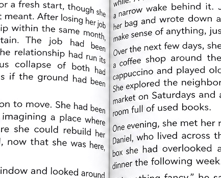
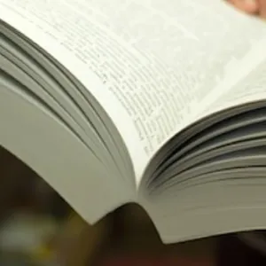
In commercial book printing, the Gutter refers to
the space that runs between two facing pages of an open book. It is the area
where the inner margin of the left side pages and the inner margin of the right
side pages meet at the spine.
The Gutter Trap refers to the potential pitfalls of not being
aware of the effects the perfect binding process can have on the inner page
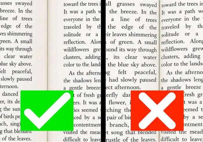
margins. Page content can actually be "swallowed up" by the gutter if the inner
margins are set too narrow.
How the Perfect Binding Process affects the Inner Page Margins (Gutter)
A portion of the gutter area is often made unusable by the perfect
binding process. Here's why…
Perfect binding uses a strong adhesive to secure the pages
within a wraparound cover. The tight bond of the adhesive not only keeps the
pages securely intact, it also adds firmness to the book's spine.
The tightly glued spine creates a strong anchor point for
the pages. This is why some resistance is felt when the pages of a perfect
bound book are opened and why the pages have to be continually held open to
read the book's content. The anchor point at the spine also explains why the
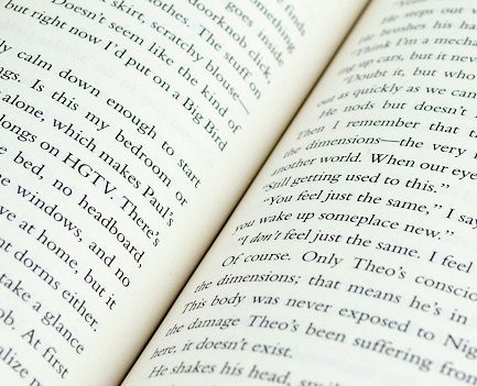
pages develop a natural curvature when the book is opened, instead of being
able to lie perfectly flat.
In fact, the more pages a perfect bound book has, the higher
the amount of page curvature. And the higher the amount of curvature, the
deeper the gutter becomes. And the deeper the gutter becomes, the greater the
potential for page content to "slide" into the gutter and make portions of the text
or images difficult to see unless the reader forces the book open further. Needless
to say, having to force the book further open not only makes for a poor reading
experience, it also puts stress on the binding.
The Fix: The best way to prevent content from disappearing into
the gutter is to set the book's inner page margins wide enough to "push" the
content further out from the spine. Expanding the inner margins helps ensure all
the page content can be viewed as intended. Of course, this means the inner page
margins will need to be set wider than the outer page margins. Doing so allows the
page content to appear balanced once the book has been printed and bound.
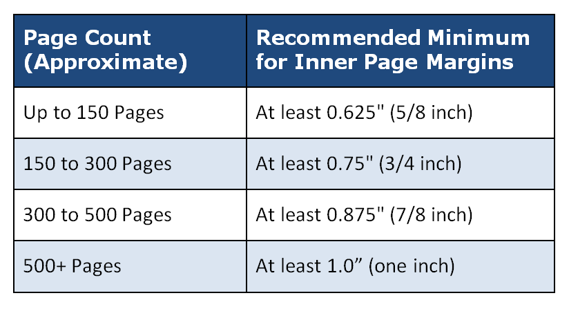
The Gutter Cheat Sheet: Recommended Minimums
To avoid content from being swallowed by the gutter, use
this table as a guide for setting up your layout. These dimensions represent
the recommended minimum settings for the inner page margins of perfect bound
books.
BONUS TIP: If you are using a heavy paper stock for the
pages (such as 80lb or 100lb text), move up to the next tier of margin width
regardless of your page count. Because thicker paper is less flexible, it will
exhibit a higher degree of page curvature. In turn, this increased curvature has
the potential to hide more content in the gutter than standard weight paper.
5 Gutter-Related Mistakes to Avoid when Laying Out Perfect Bound Books
Now that we've explained how the perfect binding process
affects the gutter, here are some gutter-related mistakes that all designers
should be aware of when laying out artwork files for perfect bound books…
Mistake 1: Using the Same Margin for Every Book Project
Some designers use the same 0.5" margin width for
every project. However, the physics of a perfect bound book change as its page
count goes up. The pages of a 400-page novel will have a deeper gutter than the pages of a 60-page book. So using the same inner margin width
for both books will lead to disappointing results. As your book's page count increases,
your inner margin must also grow to compensate for the deepening gutter.

Mistake 2: Failing to Consider the Paper Thickness
The gutter of a perfect bound book is not just affected by the
number of pages, it's also affected by the thickness of the paper.
High-quality, heavy-weight paper (like 80lb or 100lb text) is stiffer and
creates a more rigid "hinge" at the spine. This stiffness gives the
natural curvature of the pages a higher arc that that of a standard 50lb or
60lb offset paper. So, if you ignore the PPI (Pages Per Inch) of your chosen paper
stock you will likely be heading straight into the gutter trap.
Mistake 3: Using Mathematical Centering instead of Optical Centering
When laying out your artwork file, don't center your text
block perfectly on the page using equal left and right margins. Using equal
margins in the digital layout file will actually make the page content appear off-center in the finished
book. This is because the gutter "steals" visible space from the
inner margin, causing your page content to appear closer to the spine than you
intended. For a more professional appearance use optical centering, where the
inner page margin is intentionally wider than the outer page margin. As
mentioned earlier, this will make the text look centered once the book has been
printed and bound.
Mistake 4: Placing Page Numbers or Chapter Headers Near the Gutter
Page numbers and chapter headers are often the last things
designers add to a book layout. If these are placed too close to the inner
binding edge, they can get swallowed up by the gutter and become partially obscured.
Hence, always keep the book's essential navigation elements toward the outside
edges of the page or at least a safe distance from the gutter zone.
Mistake 5: Not Planning for Crossover Images
A "Crossover" is an image or graphic that spans
across two facing pages of an open book. When viewed in a digital file on a
computer screen, the crossover image may look perfect. However, when printed on
pages in a book, the middle of that image can disappear into the gutter. This
can often lead to the image having a distorted look.
To prevent this, a small sliver of the image (usually
1/8") should be duplicated on both the left and right pages so that when
the book is bound, the eye perceives the image as continuous rather than disjointed
or "cut in half." Another trick to minimize distortion in the middle
of the image is to avoid having high levels of detail, such as small text or people's
faces, in the area that jumps the gutter. If possible, blending the image to a
consistent color as it passes over the gutter is another way to eliminate any
perception of distortion or misalignment.
WARNING: Don't Let Your Computer Screen Deceive You
The most dangerous part of the gutter trap is that it is invisible
on a computer screen. When you check over your digital layout file or review a PDF
proof, you are looking at a 2-dimensional representation of a 3-dimensional
book. Hence, the screen shows the book's pages as being perfectly flat. It
doesn't show the natural curvature of the pages, how the paper is gathered at
the spine, or how content might be pulled into the gutter.
So don't let the fact that your book's pages might look
great on a computer screen give you a false sense of security - it's always
better to trust the math of the gutter, not how the pages look on an electronic
display.
A foolproof way for determining which margin sizes to use
for your specific book project is to visit a bookstore or library and look at
books that have the same width, height, and approximate page count that you are
planning for your book. Then measure the margins of the book whose appearance
is most appealing to you.
The top, bottom, and outer page margins will be easy to
measure. Just measure from the main body of the text block to the edge of the
page.
To accurately calculate the width of the inner margins, open
the book and measure from the innermost edge of the text block (the edge
closest to the spine) to the very outer edge of the page. We'll call this
measurement A. Then close the book and measure the width of the entire block of
pages. We'll call this measurement B. The difference between A and B will be
the width of the inner margin.
Ready to get your Book Project started?
Don't let layout technicalities hold you back. While it's
true that some printers do not review submitted artwork and will simply output your file
as-is, Color Vision carefully checks all artwork before printing to ensure your
book meets professional standards in both appearance and function.
Also, because we offer both digital and offset printing, we
can match your project to the most cost-effective production method.
By the way, though we can quote on book projects with as few
as 25 copies, our most cost-effective quantity range for books is typically between
100 and 5,000 copies. This is the range where you'll see the best unit price.
So if you have an upcoming project, use our simple Quote
Request form to send us your specs and we will be happy to email a quote to
you. Or, if you prefer to discuss your project by phone, give us a call at 800-543-6299
and we'll walk you through your options.
As always, Color Vision is committed to delivering a smooth
experience for your custom book project.
Related Articles
Avoid the Gutter Trap: 5 Perfect Bound Book Layout Mistakes
Read This Article
Can you Print Perfect Bound Books in Small Quantities?
Read This Article
Perfect Bound Book Printing: The Importance of a Hinge Score
Read This Article

Perfect Binding vs PUR Binding: What is the Difference?
Read This Article