
Avoid the Gutter Trap: 5 Perfect Bound Book Layout Mistakes
estimated reading time: 5 minutes
What is the Gutter Trap and How Can I Avoid it on Perfect Bound Books?
Custom printed books are one of Color Vision's specialties. Of
all the books we print, perfect binding is one of our most popular binding
options. So we thought it would be a good idea to explain what the "Gutter Trap"
is and how to avoid it when laying out your perfect bound book.
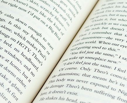
In commercial book printing, the gutter refers to the inner
margin area where two facing pages meet at the spine. The gutter trap happens when a
designer fails to account for the physical binding process, causing text or
image details to get swallowed up inside the gutter.
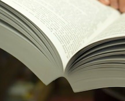
Unlike coil bound or saddle-stitched books that open flat,
perfect bound books use a hot-melt adhesive along the spine. This glued anchor
point is why the pages develop a natural curvature when the book is opened,
instead of being able to lie perfectly flat. The more pages a perfect bound
book has, the higher the amount of page curvature and the deeper the gutter
becomes.
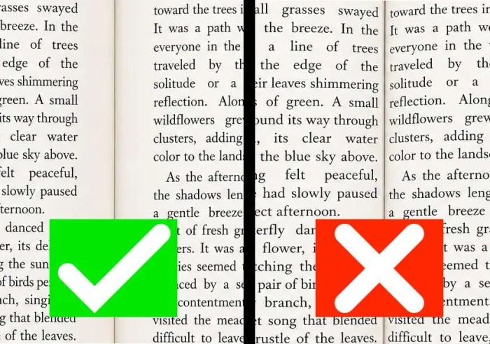
A deep gutter increases the potential for page
content to "slide" into the gutter, making portions of the text or
images difficult to see unless the reader forces the book open further.
Needless to say, having to continually force the book further open makes for a
poor reading experience.
Recommended Minimum Inner Margins
To keep all of your page content visible without requiring the reader to open the book excessively wide, set your inner margins based on your final page count:
| Page Count (Approximate) | Recommended Minimum for Inner Page Margin* |
|---|---|
| Up to 150 Pages | At least 0.625" (5/8 inch) |
| 150 to 300 Pages | At least 0.75" (3/4 inch) |
| 300 to 500 Pages | At least 0.875" (7/8 inch) |
| 500+ Pages | At least 1.0" (one inch) |
*If
you plan to use a heavier stock for the pages (like 80# or 100# text), bump up
to the next margin tier. Thicker papers resist bending, creating a steeper
curve into the spine.
5 Gutter Mistakes Our Prepress Team Sees Most Often
1. Using the Same Margin for Every Book Project: The physics of
a perfect bound book change as its page count goes up. The pages of a 400-page book
will create a deeper gutter than the pages of a 60-page book. Thus, the inner margin
must be widened to compensate for the deepening gutter.
2. Failing to Consider the Paper Thickness: The gutter of a
perfect bound book is not just affected by the number of pages, it's also
affected by the thickness (caliper) of the paper. Because heavier text paper (like
80# or 100#) is naturally stiffer, it gives the curvature of the pages a
higher arc than that of a standard 50# or 60# text paper. So, if you ignore
the PPI (Pages Per Inch) of your chosen paper stock, you will likely be walking
straight into the gutter trap.
3. Relying on Mathematical Centering instead of Optical
Centering: Using equal left and right page margins in your digital layout file
will actually make the page content appear off-center in the finished book. This
is because the gutter "steals" visible space from the inner margin.
The solution is to use optical centering, where the inner page margin is
intentionally wider than the outer page margin. This will make the text look
centered once the book has been printed and bound.
4. Placing Page Numbers or Section Headers Too Close to the Gutter:
Page numbers and running headers placed too close to the inner binding edge can
get swallowed up by the gutter and become unreadable in a bound book. Keep
essential navigation elements toward the outer edges of the page or at least a
safe distance from the gutter zone.
5. Mismanaging Crossover Images: A
"Crossover" is an image or graphic that spans across two facing pages
of an open book. The crossover may look perfect on a computer screen, but when
printed, the middle of that image can disappear into the gutter, leading to distortion
of the overall image. To prevent this, add 1/8" of image duplication
(crossover safety) to both inner edges. Also, avoid having high levels of
detail, such as small text or people's faces, in the area that jumps the
gutter.
Don't Rely on Digital Screen Previews
Over the years, we've seen new designers get caught off guard by the fact that the gutter trap is invisible on a computer screen. So when checking over your digital
layout file, please be aware that you are looking at a 2-dimensional representation of
a 3-dimensional book. Hence, the screen will show the book's pages as being
perfectly flat. It doesn't show the natural curvature of the pages, how the
paper is gathered at the spine, or how content might be pulled into the gutter.
So it's always better to trust the
math of the gutter, not how the pages look on an electronic display.
Ready to get your Book Project started?
Don't let layout technicalities hold you back. If you are unsure how your paper stock and page count will affect your binding, call our specialists at 800-543-6299.
While it's true some printers do not review submitted
artwork and will simply output your file as-is, Color Vision's prepress
team carefully checks all artwork files, including margin safety
zones, before printing. This ensures your book meets professional standards in
both appearance and function.
If you have an upcoming book project, use our simple Quote
Request form to send us your specs and we will be happy to email a quote
to you.

Pete is a member of the Color Vision team and has nearly 20 years experience in printing, design, and marketing. He writes about a wide range of print-related topics, including book printing and binding, full-color printing, paper types, and finishing techniques. His articles contain simple, straightforward explanations, helping people to better understand their printing options and make more informed decisions about their projects.
Related Articles

EVA vs PUR: Which Glue is Better for Perfect Bound Books?
Read This Article

Soft Cover Children’s Books: 5 Options to Enhance Durability
Read This Article
Perfect Bound Book Printing: 7 Reasons to Bind with PUR Glue
Read This Article
Comic Book Binding: Exploring the Two Most Popular Methods
Read This Article