
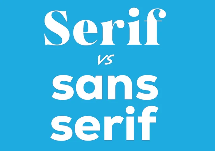
Serif vs Sans Serif Fonts: Which to use for a Print Project?
estimated reading time: 5 minutes
Fonts influence the Look, Tone, and Effectiveness of Print Materials
Whether you're designing a book, brochure, catalog, postcard,
business card or something else, one of the key decisions in any print project
is choosing the appropriate font.
Choosing the right font is important because it not only
affects the appearance and readability of your printed piece, it also strongly influences
how your message will be perceived by your audience.
It's something most people don't consider, but fonts are
able to give printed words a distinct tone. So it is important to select the font
that best aligns with your messaging. For example, your choice of font could project a tone that's friendly, authoritative,
modern, traditional, elegant, trustworthy, whimsical, or any other "personality"
you wish your print materials to have.
A well-matched typeface strengthens your communication and
supports the purpose of the printed piece, whereas the wrong one could conflict with your message and weaken its effectiveness.
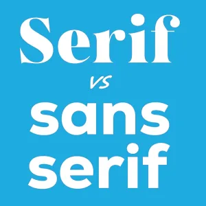
Two of the most fundamental categories of fonts are Serif
and Sans Serif. Understanding the differences between these two font types -
and when to use each - can dramatically improve the clarity and impact of your
print project.
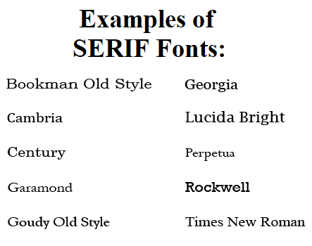
What are SERIF Fonts?
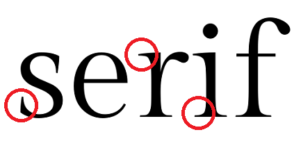
Serif fonts are typefaces that feature little decorative strokes
that extend from the ends of letters. These small extensions, known as "Serifs",
trace all the way back to ancient Rome where stone carvers added them to engraved
letters as a finishing touch. The contrast between the thick and thin strokes gives the letters an elegant, ornate quality.
Because Serif fonts have been used for centuries, they
convey a classic, timeless look. The Serif extensions help lead a reader's eyes
along lines of text, making Serif fonts particularly effective for print
materials that provide a lengthier reading experience.
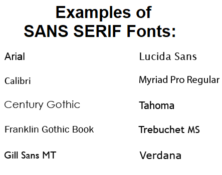
What are SANS SERIF Fonts?
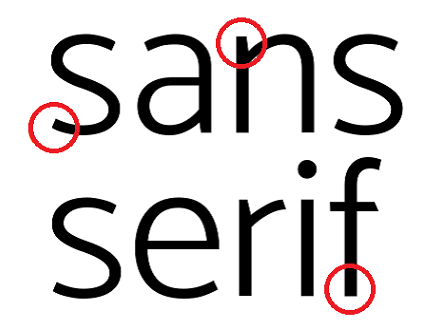
Sans Serif fonts are typefaces that lack the small
decorative strokes, or "Serifs," at the ends of letters. The name
comes from the French word "Sans," meaning "without". Unlike
Serif fonts, Sans Serif fonts typically maintain a consistent stroke thickness
which contributes to their modern and straightforward appearance.
Sans Serif fonts were first introduced in the early 19th
century and gained prominence during the 20th century. Sans Serif
fonts are known for their clean and simple appearance, making them popular for concise
yet strong messaging.
Key Differences between SERIF and SANS SERIF Fonts
The difference between these two font families goes beyond
the presence or absence of Serifs. Each font type will also have a different effect
on the tone and readability of your printed documents.
Serif fonts are often used to communicate a sense of tradition,
authority, trust, and sophistication. As a result, Serif fonts are a good
choice for print communications aimed at mature consumers.
On the other hand, Sans Serif fonts deliver a more contemporary,
minimalistic, and approachable tone. Hence, Sans Serif fonts are a good fit for
print communications geared toward younger consumers.
Regarding readability, Serif fonts are considered to be a better
choice for print projects that contain a substantial amount of text. This is because the Serifs
subtly guide the eye from letter to letter and line to line.
Even though Sans Serif fonts appear clean and simple, they
can sometimes tire the eyes when reading lengthy blocks of printed text. As such, Sans
Serif fonts work better when used for shorter, high-impact content that can be
read quickly.
Best Uses for SERIF Fonts in Print Projects
Because the structure of Serif fonts enhances the
readability of long blocks of printed text, Serif fonts are well-suited for the body
copy of books, booklets, manuals, catalogs, magazines, info guides or any other
printed pieces that contain substantial amounts of text.
Since Serif fonts also impart a sense of authority and
trust, they are an excellent choice for brochures and pamphlets used in
industries where credibility and professionalism are extremely important. For
example, printed materials used for financial, legal, or medical services are
often designed with Serif fonts.
In addition, because Serif fonts convey sophistication and formality,
they are often chosen for ceremony programs, award certificates, invitations,
and upscale restaurant menus.
Best Uses for SANS SERIF Fonts in Print Projects
Though Sans Serif Fonts may not be the best choice for long passages of printed body copy, they are great for just about every other application. Because Sans Serif fonts are easy to read in quick bursts, they work well for lines of text that are short and succinct, such as headings, subheadings, captions, taglines, and product names.
Sans Serif fonts are also highly versatile and scale well
for use on large or small print projects. They look crisp and bold from a
distance, which makes them a good choice for large format items such as
posters, banners, signage, and trade show displays.
They also provide clean and quick messaging for smaller
printed items that rely on uncluttered designs and rapid scanning, such as
business cards, table tents, rack cards, and direct mail postcards. The clarity and simple
structure of San Serif fonts allows readers to instantly grasp the main message.
Plus, because the sleek appearance of Sans Serif fonts stands
out and commands attention, especially when printed in bold or italics, these
fonts work extremely well for brochures, flyers, sell sheets and other pieces
used for marketing or promotional purposes.
Can SERIF and SANS SERIF Fonts be used in Combination?
100% YES! In fact, using a Serif font and a Sans Serif font in
the same layout is one of the most effective and widely recommended
combinations in print design.
The most common strategy for pairing the two font types is
to use a Serif font for the body text and a Sans Serif font for headlines. This
approach creates immediate visual contrast and helps the eyes instantly
recognize what's a headline and what's body copy, thereby creating a clear
hierarchy.
Though less common, a Sans Serif font could be used for the
body text and a Serif font for the headlines. As long as the two typefaces complement
each other and guide the reader effortlessly
through your content, you are on your way to success.
Color Vision is Always Ready to Help!
If you have any print-related questions or have an upcoming print project, be sure to get in touch with Color Vision Printing.
Our
friendly and experienced staff is always ready to serve you. We can assist with
just about any print project you may have - books, manuals, catalogs,
brochures, flyers, postcards, and more!
To get a price quote, use our simple Quote Request form to
send us your project's specifications and we will be happy to email a quote to
you. Or, if you prefer to discuss your project by phone, give us a call
at 800-543-6299.
As always, we look forward to assisting with your custom printing needs!
Related Articles
Printing Paper: Text Weight vs Cover Weight Explained
Read This Article

10 Frequently Asked Questions about Bleed and Crop Marks
Read This Article
Serif vs Sans Serif Fonts: Which to use for a Print Project?
Read This Article

Raster vs Vector Images: The Key Differences Explained
Read This Article