
What is a Pantone Color?
estimated reading time: 5 minutes
Pantone Definition…
Pantone is an American company headquartered in Carlstadt,
New Jersey. In 1963, Pantone developed a proprietary system for categorizing
colors. This system is known as the Pantone Matching System.
So when you see or hear the term Pantone Color, it is a reference
to one of the more than 2,000 colors within the Pantone Matching System.
The Pantone company created its name by combining the word "Pan"
(meaning All) with the word "Tone" (meaning Color). It turned out to be a visionary
name choice because the Pantone Matching System has become the worldwide standard
for selecting, communicating, and matching colors.

Why is the Pantone Matching System important?
Have you ever tried to accurately describe a color using words
alone? Whether you use written or verbal communication, it is virtually
impossible to accurately describe a specific hue or tint. Even if the color has
a descriptive name, like Forest Green or Mustard Yellow, different people can
have varying interpretations of what these colors actually look like or how to duplicate
them.
The Pantone Matching System has eliminated this ambiguity by organizing a multitude of colors in a logical sequence, assigning unique identification
numbers for each one, and displaying the formulas needed for replication.
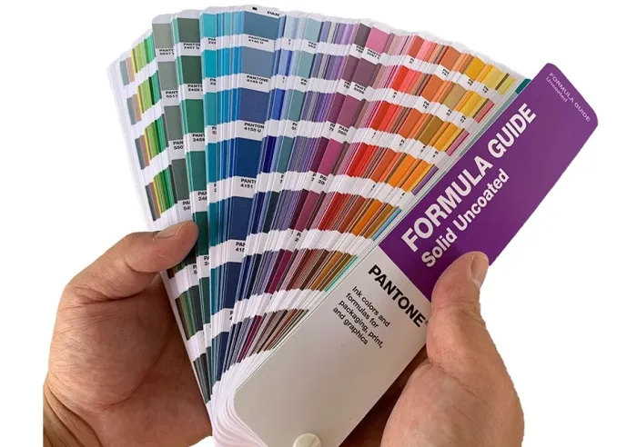
Pantone publishes this information in easy-to-use guidebooks,
which are available worldwide. These guides are designed as a bound deck of color swatch cards. The swatch cards fan out for quick referencing. Pantone offers several versions, including
ones that show how the various colors will appear on coated or uncoated paper
stocks.
By referring to these Pantone color guides, a customer in
one city can select a color from the Pantone book and easily communicate
the exact color to a printing company in another city. Likewise, an
advertising agency in one country can easily communicate an exact color to a graphic
designer in another country.
The Pantone system solves the complicated problem of sharing
accurate color information among multiple stakeholders in different locations.
Pantone Colors and the Printing Industry
The Pantone Matching System is an invaluable
resource for the printing industry, helping graphic designers, printers, and customers
select, communicate, and match colors. Because the Pantone color system ensures that everyone is on the same page, it helps streamline both the design and printing
processes.
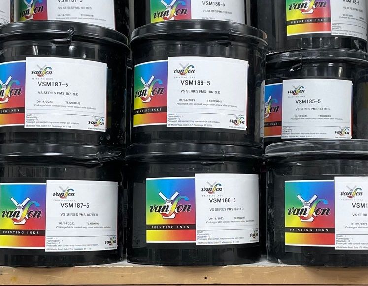
Unlike CMYK ink colors that intermingle on the paper to form
new colors, Pantone ink colors are created from precise formulas. These formulas
specify the exact mix of pigments needed to achieve a specific color and are
carefully calibrated to ensure consistency across different materials and
printing processes.
The Pantone system not only ensures that colors are
reproduced accurately across different types of media, it also helps to maintain
color consistency for corporate branding and marketing purposes.
Pantone Colors vs CMYK Process Colors
The CMYK printing process can create around 16,000 colors, but
there are some colors the CMYK process cannot produce. This is where Pantone
colors come to the rescue by supplementing the color palette available for printing
projects.
Unlike CMYK process printing, which simulates colors by
overlapping dots of cyan, magenta, yellow, and black ink colors on the paper, Pantone
colors are pure colors. They are pre-mixed prior to being placed into the
printing press and are applied as solid colors on the paper.
A printing company will often mix the pigments in-house unless
a project requires a large volume of ink. In that case, it is generally more
efficient to order the Pantone ink pre-mixed.
Some projects are printed exclusively with one or more Pantone
ink colors. Pantone ink colors can also be used in addition to the four CMYK
ink colors, especially if a project requires a specific standalone color in addition to full-color printing.
What is The Pantone Color of the Year?
In addition to colors used for printing and graphic design, Pantone offers colors for use by other industries. These industries include fashion, home furnishings, and interior design.
Pantone services these industries with a separate color system
called Fashion, Home + Interior (FHI). The FHI color system is designed for use with textiles as well as non-fabric
materials such as paint, cosmetics, and furniture.
Since the year 2000, Pantone has been announcing its "Color of the Year." Publicized every December, Pantone's annual choice helps set the trend for the creative use of color in the upcoming year. On a few rare occasions, Pantone has proclaimed two colors for one calendar year.
Geared primarily toward the fashion
and home décor industries, Pantone's Color of the year has tremendous influence
over the color of products offered during a given year.
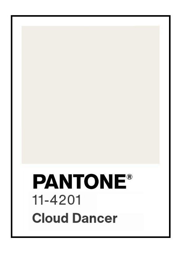
By the way, the Color of the Year for 2026 is Cloud Dancer (Pantone
# 11-4201).
Other names for Pantone Colors
In the printing industry, Pantone colors are often referred
to by a couple different names.
Because the Pantone Matching System is commonly abbreviated
as PMS, the colors included in the Pantone Matching System are often referred
to as PMS colors.
Also, Pantone colors are sometimes called "Spot" colors. This is to help differentiate the standalone Pantone colors from the CMYK process colors.
Unlike the cyan, magenta, yellow, and black ink colors used for CMYK printing, Pantone inks almost never intermingle with other ink colors on the paper. This is because Pantone inks are intended to be used as solid colors. As such, they are designated for certain "Spots" within the design.
Need help with a Pantone printing project?
If you are looking to have a project printed with Pantone
colors, be sure to get in touch with Color Vision. Whether your printed piece
will use Pantone colors exclusively, or will require Pantone colors in
combination with CMYK process printing, we have the equipment and expertise to
make your project a success.
Just give us a call at 800-543-6299 to discuss your
needs. Or, if you would prefer to get a quote by email, you can send us a Quote
Request by clicking here. We hope to hear from you soon and look forward
to assisting with your custom printing needs!
Related Article: What is a Spot Color?
Related Articles
Printing Paper: Text Weight vs Cover Weight Explained
Read This Article
10 Frequently Asked Questions about Bleed and Crop Marks
Read This Article
Serif vs Sans Serif Fonts: Which to use for a Print Project?
Read This Article
Raster vs Vector Images: The Key Differences Explained
Read This Article