
What is Reverse Printing?
estimated reading time: 3 minutes
Reverse Printing
In order for printed text to be clear and readable, there
has to be a sufficient level of contrast between the color of the text and the
color of its background. Hence, a dark colored ink on light colored paper is a
popular choice for print materials because this combination provides high
contrast.
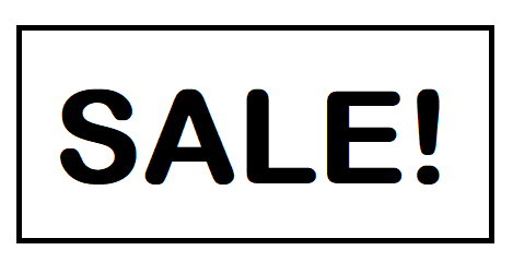
In order to help explain the concept of Reverse
Printing, we'll be using the high contrast example of black ink on white paper. Plus, we'll imagine ourselves designing and printing a promotional flyer with a
large heading that reads "SALE!"
If we use a traditional design format, the text will be
printed in black ink and the white paper will provide the contrasting
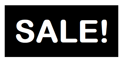
background (see Illustration A). However, if we use a Reverse format,
the area surrounding the text will be printed in black ink and the text itself
will be formed by the white paper that is left unprinted (see Illustration B).
Reverse Printing is a simple but creative design technique
In addition to text, simple graphics and company logos are commonly printed as a reverse.
Also, reverse printing is sometimes referred
to as Knockout printing because the text or graphic is "knocked out" of the ink
impression. This allows the underlying paper stock to provide the contrasting
color needed for the reverse, whether the stock is white, natural, a pastel, or
other color.
Below are some general guidelines for Reverse Printing:
> Reverse printing works best with darker ink colors. This
is because darker inks provide more sharpness and definition around the
perimeter of the text or graphic.
> The reverse printing technique also works best with simple, sans
serif styles of text. Plus, it works best with larger text, such as boldface
headings and titles. Any text that is too small or intricate risks having some
of the finer details filled in by ink.
> In addition to text, simple graphics and logos can be
printed as a reverse. Just like with text, graphics that contain intricate
details are not a good candidate for being printed as a reverse.
> The use of a reverse is not limited to a solid
background color. For example, a reverse could be used within a photo or a
patterned design. However, color variations might affect the sharpness of the outline. In this case, a drop shadow might be needed to help define the
perimeter of the text or graphic.
> If reverse printing is used to draw attention and add emphasis to specific headings or phrases, it should be used sparingly so as not to diminish its effectiveness.
> Reverses can be used on just about any type or size of
printed product, from posters to business cards.
Color Vision is your one-stop source for quality printing!
The Reverse technique can enhance your print materials and help them leave a
lasting impression. So let us know if you have any questions about this
technique or any other print-related topic.
Color Vision has been producing quality printing since
1984. We can assist with just about any print project you may have - manuals,
catalogs, comic books, brochures, flyers, postcards, maps, calendars and more!
So whenever a need for custom printing arises, just give us
a call at 800-543-6299 to discuss your project. Or, use
our simple Quote Request form to submit your specifications and
we will email you a quote.
As always, we look forward to assisting with your custom
printing needs!
Related Articles
Printing Paper: Text Weight vs Cover Weight Explained
Read This Article
10 Frequently Asked Questions about Bleed and Crop Marks
Read This Article
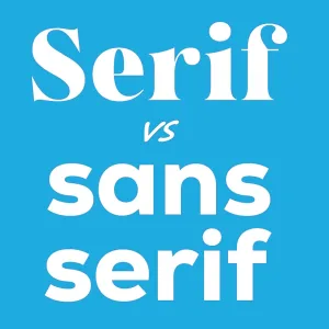
Serif vs Sans Serif Fonts: Which to use for a Print Project?
Read This Article
Raster vs Vector Images: The Key Differences Explained
Read This Article