
Business Card Printing: 5 Common Mistakes to Avoid
estimated reading time: 7 minutes
Printed Business Cards are Reliable Networking Tools
Despite the rapid pace of digital innovation, printed Business
Cards continue to be reliable networking tools for professionals across every
industry.
Business cards offer a quick way to introduce yourself and your
company, helping to make a positive first impression when meeting clients or
business associates. Business cards also provide a convenient way to share
contact details, such as phone, email, and web address.
A well-designed business card not only reinforces your
competency and attention to detail, it helps enhance your company's brand
identity. Also, unlike digital communication, a printed card provides a
physical reminder of your business, leaving a more lasting impression.
So whether you're planning to order new business cards or
considering a redesign, avoiding the 5 common mistakes listed below will ensure
your cards reflect the professionalism and credibility you want to convey.

5 Common Mistakes when Printing Business Cards:
1. Using Design Elements that Conflict with Brand Identity
The design elements a company chooses to represent its brand
- colors, logo, typography, styling, tagline - is what builds familiarity and enables
customers to remember the company and its brand.
When used consistently, these design elements help build
instant brand recognition. As such, it is essential that all marketing channels,
including printed materials, website, social media pages, packaging, signage,
etc., display a cohesive brand identity.
Since business cards are commonly presented when meeting
someone for the first time, they often provide the initial introduction to a
company and its brand. As such, it is important that the business card display
design elements that are consistent with the rest of the company's marketing.
When all of a company's marketing materials, including
business cards, share the same branding it demonstrates that the company is well
organized and credible. It also helps build trust and reinforces what makes the
company memorable.
Conversely, using colors, font styles, imagery and other design
elements that don't align with a company's brand identity can send mixed
signals to the target audience, potentially reducing credibility and weakening
brand recall.
After all, the purpose of a business card is to help
establish and reinforce brand identity, not conflict with it.
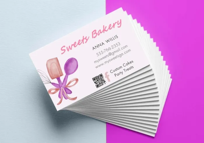
2. Overcrowding the Layout with Excess Information
The purpose of a business card isn't to provide detailed
explanations or list everything you have to offer (those functions are better
left to brochures, catalogs, and line cards). The purpose of a business card is
to make a quick introduction and provide some simple ways to get in touch.
Basically, a business card should answer these questions: Who are you? What do
you have to offer? How do I contact you?
It's no secret that the size of a standard business card is
only 3.5" wide by 2" high. So by design, the card is intended to be printed
with concise content. The brevity of a business card is actually what makes it inviting
and more likely to be read. However, packing the card with too much information
can transition the card from inviting to overwhelming, making it less likely to
be read.
Also, overcrowding the business card's layout with more details
than necessary makes the card appear cluttered. This visual noise can negatively
affect readability, diluting the key details and making the card less effective
at communicating its core message. Adding too much content can also give
the impression the company lacks focus or has ineffective communication
skills.
Having said all that, there is an effective solution for
presenting additional information without cluttering the layout of a business
card: include a QR code. Whether printed on the front or back of
the card, a QR code can be scanned with a cell phone to provide immediate
access to a webpage, video, promotional offer, social media profile, customer
testimonials, or any other digital content.
In summary, a business card layout should be well-organized
but kept relatively simple. This will ensure it communicates key information in an efficient
manner and makes a positive impression on the recipient. Also, QR codes are a
big plus because they can provide supplemental information without taking up
much space on the card.
3. Using a Low Quality Paper Stock
Using a low-quality paper stock for a business card is a
mistake because it undermines your professional image and weakens the card's
durability, both of which reflect poorly on your brand.
As mentioned earlier, a business card is often the first printed
communication someone will encounter from your business. If you choose paper that
is flimsy or feels cheap, it can make your company appear unprofessional or
low-budget. This is because most people will naturally associate the quality of
your print materials with the quality of your products and services.
Even though this may not be an accurate assessment, it can still negatively
affect the customers' perception of your business or brand and cause some to question
your commitment to excellence. Unfortunately, these initial perceptions aren't
always easy to change.
Another issue with low-grade paper stock is that it will crease and tear more
easily. This not only leads to premature signs of wear, it increases the odds
the card will get discarded before the recipient even has a chance to follow up.
Though a business card printed on low-quality stock is
unlikely to leave a lasting impression, premium paper stocks offer thicknesses
and finishes that will make your card stand out from the crowd. That said,
whether you select a textured or smooth finish, aim for a cardstock thickness
of at least 14pt (300gsm). This will ensure your card stays presentable longer,
especially since many are carried about in a wallet or pocket.
In addition to boosting the quality and durability of
business cards, premium stocks are also better suited for special enhancements
like embossing, foil stamping, die-cutting, spot UV, and soft-touch coatings,
which can further elevate a business card's design.

4. Not Clearly Stating your Company's Core Offering
Unless the company name itself clearly indicates the core
offering, it is important to include a tagline or other verbiage on the card
that states what you have to offer. Why? Because if people can't quickly
discern what your business does, they're less likely to follow up with you or
refer you to others.
Hence, the lack of clarity often translates to lost opportunities.
You may distribute cards to dozens of people, but without a clearly stated
offering, those contacts can easily forget why they should reach out.
For example, a business card that shows "Jackson Enterprises
LLC" or "ACME Services" without a more descriptive tagline or value proposition
can lead to confusion and a total lack of engagement. However, by simply adding
a line such as "Cell Phone Repair" or "Commercial HVAC Maintenance" the
offering becomes clear…and this clarity is what fuels engagement, brand recall,
and follow-up.
Also, if the core offering is vague or missing, the company can come
across as unpolished or lacking focus, potentially weakening the brand message
because it leaves people guessing. Unfortunately, guessing rarely translates
into business.
Though failing to state the core offering is a common mistake, a well-crafted business card will leave no doubt about what a company has to offer.
5. Failing to Proofread all Content Carefully
Needless to say, having the correct contact information on a
business card is vitally important. So you may be surprised to learn that a
business card's contact information is the area most overlooked by print clients
during the proofreading phase.
There are a couple of factors that contribute to this
phenomenon. The first contributing factor is the fact that the contact
information contains proper names, such as the names of people, companies,
streets, cities, and websites, as well as numeric data like addresses, phone
numbers and extensions.
Being proper names instead of common words, a spelling error will not necessarily stand out. Neither will a mistyped or transposed number. Also, people tend to gloss
over data they see on a regular basis. This means familiar data rarely gets the required
scrutiny.
For example, a sales manager proofing his team's business cards could easily overlook a card that shows the name Lindsay instead of Lindsey or Michele instead of Michelle. Or, a person can see their business phone number of "877-555-6668" so many times over the years that they miss the fact that it is showing as "877-555-6688" on the business card proof. The human brain often sees what it expects to see rather than what is actually printed there.
Of course, words that aren't proper nouns can be misspelled
as well. If these mistakes happen to slip through, it can undermine credibility
and raise doubts about the issuing company's professionalism. A customer may
conclude that if a company cannot effectively proofread its own business cards,
it may not be reliable in other areas, such as delivering on its promises or
paying close attention to details.
So it is extremely important to review all of the content on
business cards prior to having them printed. To be extra safe, it is even advisable to have
multiple people review the proof. Careful proofreading will help avoid
embarrassing errors and greatly minimize the need for a reprint, which would
add unnecessary expense, time, and aggravation to the business card project.
Let Color Vision help with your next Custom Printing Project!
Color Vision has been in the commercial printing
business for over four decades. We've built a strong reputation in the industry
by offering quality printing at affordable prices. We're also known for our
friendly and helpful service.
In addition, we can assist with just about any print project
you may have - business cards, brochures, flyers, books, catalogs, postcards,
and more!
Just give us a call at 800-543-6299 to discuss
your printing needs. Or, use our simple Quote Request form to send us
your specifications and we will be happy to email a quote to you.
As always, we look forward to hearing from you and hope to assist with your next print project!
Related Articles

The Golden Touch: 5 Ways Foil Stamping Enhances Your Brand
Read This Article
Printing Production: Understanding the Role of Prepress
Read This Article

Coated vs Uncoated Paper: Which to Choose for Your Project?
Read This Article

The 5 Most Affordable Types of Book Binding
Read This Article