
White Space: The Importance of White Space in Graphic Design

estimated reading time: 4 minutes
What is White Space?
In the context of graphic design, White Space is the portion
of a layout that does not contain text, images, or other objects. In other
words, white space refers to all the areas of an artwork composition that are left
"empty."
As such, white space includes the gaps between letters,
words, sentences, and paragraphs as well as the margins and gutters that help
frame the content. It also includes the unused space between images and other
objects on a page.

Sometimes called negative space, white space acts as a visual
separator; keeping the various components within an artwork layout from
appearing crammed or cluttered. Also, surrounding certain objects with more
white space than others enables them to stand out more prominently on the page.
It is important to note that white space is generically referred
to as "white" because that is the base color of most paper stocks. However, despite
its name, white space doesn't have to literally be white - it can be any color,
pattern, or background design as long as it helps bring the important elements of
a design to the forefront.
Why is White Space Important?
While some may view white space as wasted or unproductive
space, it actually plays a vital role in creating a design that is aesthetically appealing and effective.
Below are several reasons why the use of white space is so
important:
1. Improves Readability and Boosts Comprehension
Having ample white space around images and blocks of text reduces
visual clutter, making it easier to read, process, and comprehend the content.
White space also helps guide the eyes naturally from one
element to the next, improving the flow and making the reading experience more
comfortable.
2. Draws Attention and Enhances Focus
The strategic use of white space helps structure the content
and draw attention to key elements - such as headings, calls to action, or images.
A layout with generous white space makes the design more "breathable",
helping important elements to stand out on the page.
3. Creates a Sense of Balance and Harmony
White space helps distribute the design elements evenly
across the page, creating a more balanced composition.
Without enough white space, layouts can appear chaotic and visually overwhelming.
4. Improves Aesthetics and Reinforces Branding
White space can reflect positively on brand identity. For
example, luxury brands often incorporate a lot of white space to communicate elegance
and exclusivity.
Clean and uncluttered designs also convey professionalism,
sophistication, and trustworthiness.
5. Encourages Engagement and Cultivates Interest
A well-organized layout with generous white space increases
the likelihood that readers will spend more time with the content.
In turn, this increases the likelihood of them following
through with the intended action, such as contacting a salesperson or making a
purchase.
Active vs Passive White Space
Active White Space refers to white space that is used
intentionally to guide the viewer's attention or create emphasis. Active white
space is strategically incorporated into a design to enhance aesthetics, control
the visual flow, and highlight important content. It is a conscious design
choice.
Passive White Space, on the other hand, is not a conscious
design choice. It occurs naturally during the creation of a layout. It's the
default spacing between letters, words, and lines of text, as well as the padding around objects
like images and logos. While passive white space is not purposely added for emphasis, it is essential
for the readability and organization of the content.

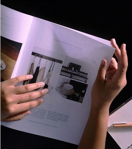
Micro vs Macro White Space
Micro White Space refers to small scale spacing, such as the
subtle spacing between letters, words, lines of text, and paragraphs, as well
as the spacing between an image and its caption or surrounding text. Micro white space enhances legibility, helping
the reader process information more easily.
Macro White Space refers to the larger, more obvious spaces within
a design. Examples include page margins, wide gaps between objects, or large
open areas in minimalist layouts. Macro white space helps guide the viewer's eye
and can create a sense of calmness, luxury, or focus. It is also used to structure
a page into easily digestible parts as well as for highlighting specific
elements of the design.
Let Color Vision assist with your next Print Project!
If you have any print-related questions or have an upcoming print project, get in touch with Color Vision Printing.
Our professional
and experienced staff is always ready to serve you. Plus, you'll be pleased
with our affordable pricing on digital printing, offset printing, finishing,
and binding.
We are always happy to discuss your projects, so give us a
call at 800-543-6299. Or, fill out our simple Quote Request form and we will send you a custom quote by email.
As always, we look forward to assisting with your custom
printing needs!
Related Articles

Printing Terminology: What is Paper Grain?
Read This Article

What does Collate mean in Printing?
Read This Article

What is Synthetic Paper?
Read This Article
Printing Terminology: Simplex vs Duplex Printing
Read This Article